Best way to fix background pic so text is readable
This discussion is connected to the gimp-user-list.gnome.org mailing list which is provided by the GIMP developers and not related to gimpusers.com.
This is a read-only list on gimpusers.com so this discussion thread is read-only, too.
| Best way to fix background pic so text is readable | GerryPeters | 22 Mar 02:30 |
| Best way to fix background pic so text is readable | rich404 | 22 Mar 12:36 |
| Best way to fix background pic so text is readable | GerryPeters | 22 Mar 16:49 |
| Best way to fix background pic so text is readable | rich404 | 22 Mar 17:53 |
| Best way to fix background pic so text is readable | GerryPeters | 23 Mar 05:15 |
| Best way to fix background pic so text is readable | GerryPeters | 01 Apr 06:32 |
| Best way to fix background pic so text is readable | rich404 | 01 Apr 07:44 |
| Best way to fix background pic so text is readable | GerryPeters | 01 Apr 16:50 |
| Best way to fix background pic so text is readable | rich404 | 01 Apr 18:25 |
| Best way to fix background pic so text is readable | GerryPeters | 01 Apr 20:15 |
| Best way to fix background pic so text is readable | GerryPeters | 01 Apr 18:10 |
- postings
- 54
Best way to fix background pic so text is readable
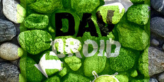
Notice the CD label attachment. The text on the rocks on the left is hard to read only in certain spots that are too dark or black. What's the easiest way to alter the colors in those spots? It seems like copying rocks that are more white in those places may be very good and then possibly a way to blend the seams.
-
 label
label
CINDY_CD_LABEL_2.JPG (58.2 KB)
Best way to fix background pic so text is readable
Notice the CD label attachment. The text on the rocks on the left is hard to read only in certain spots that are too dark or black. What's the easiest way to alter the colors in those spots? It seems like copying rocks that are more white in those places may be very good and then possibly a way to blend the seams.
That is so horrible, too small, full of jpeg artifacts, best advice is find a better image.
Hope you are not trying to print that
However, since it is so small, dive in with a one pixel brush, use a light colour, paint out the dark areas. Then use black and try and touch up the text (such as it is)
-
 still too small
CINDY_CD_LABEL_2.png (367 KB)
- postings
- 54
Best way to fix background pic so text is readable
That is so horrible, too small, full of jpeg artifacts, best advice is find a better image.
Hope you are not trying to print that
However, since it is so small, dive in with a one pixel brush, use a light colour, paint out the dark areas. Then use black and try and touch up the text (such as it is)
I just made a snipping tool screen copy of it. that's not the real image, which is 300 dpi. Can I point to the whitish rock color and match that color? So would I need to touch up the black text if I was careful not to accidentally color it?
Best way to fix background pic so text is readable
I just made a snipping tool screen copy of it. that's not the real image, which is 300 dpi. Can I point to the whitish rock color and match that color? So would I need to touch up the black text if I was careful not to accidentally color it?
That will be better. Even better if the text is on a separate layer? Assuming that it is not.
You can isolate the text by selecting it, then inverting the selection and painting around it.
Try something like this. Using your jpeg scaled up 400% so a bit fuzzy.
Use the colour select tool and increase the threshold up to maybe 30. Click inside the black text to select. see screenshot: https://i.imgur.com/Ax0FPTk.jpg
Now grow the selection a pixel or 2 to make sure make sure the text outline is inclusive. screenshot: https://i.imgur.com/JZAyJ5k.jpg
Invert the selection Select -> Invert.
I would use the clone tool to clone in adjacent light areas https://docs.gimp.org/en/gimp-tool-clone.html - not the best description in the world.
Use a fuzzy brush with suitable size, ctrl-click to select a (light color) source. Then just paint over the dark area around the text. https://i.imgur.com/7zSCkMc.jpg The active selection prevents painting out the text.
You can repeat for the other areas. https://i.imgur.com/bwy3HgJ.jpg choosing a new clone source for each.
When complete kill the selection Select -> None. You might still have to go in at high zoom and 'tweak' parts of the text to improve legibility. Depends how keen you are.
rich: www.gimp-forum.net
- postings
- 54
Best way to fix background pic so text is readable
That will be better. Even better if the text is on a separate layer? Assuming that it is not.
You can isolate the text by selecting it, then inverting the selection and painting around it.
Try something like this. Using your jpeg scaled up 400% so a bit fuzzy.
Use the colour select tool and increase the threshold up to maybe 30. Click inside the black text to select. see screenshot: https://i.imgur.com/Ax0FPTk.jpg
Now grow the selection a pixel or 2 to make sure make sure the text outline is inclusive. screenshot: https://i.imgur.com/JZAyJ5k.jpg
Invert the selection Select -> Invert.
I would use the clone tool to clone in adjacent light areas https://docs.gimp.org/en/gimp-tool-clone.html - not the best description in the world.
Use a fuzzy brush with suitable size, ctrl-click to select a (light color) source. Then just paint over the dark area around the text. https://i.imgur.com/7zSCkMc.jpg The active selection prevents painting out the text.
You can repeat for the other areas. https://i.imgur.com/bwy3HgJ.jpg choosing a new clone source for each.
When complete kill the selection Select -> None. You might still have to go in at high zoom and 'tweak' parts of the text to improve legibility. Depends how keen you are.
rich: www.gimp-forum.net
Man the clone tool was perfect for this fix - very easy to use - thanks so much
- postings
- 54
Best way to fix background pic so text is readable
That will be better. Even better if the text is on a separate layer? Assuming that it is not.
You can isolate the text by selecting it, then inverting the selection and painting around it.
Try something like this. Using your jpeg scaled up 400% so a bit fuzzy.
Use the colour select tool and increase the threshold up to maybe 30. Click inside the black text to select. see screenshot: https://i.imgur.com/Ax0FPTk.jpg
Now grow the selection a pixel or 2 to make sure make sure the text outline is inclusive. screenshot: https://i.imgur.com/JZAyJ5k.jpg
Invert the selection Select -> Invert.
I would use the clone tool to clone in adjacent light areas https://docs.gimp.org/en/gimp-tool-clone.html - not the best description in the world.
Use a fuzzy brush with suitable size, ctrl-click to select a (light color) source. Then just paint over the dark area around the text. https://i.imgur.com/7zSCkMc.jpg The active selection prevents painting out the text.
You can repeat for the other areas. https://i.imgur.com/bwy3HgJ.jpg choosing a new clone source for each.
When complete kill the selection Select -> None. You might still have to go in at high zoom and 'tweak' parts of the text to improve legibility. Depends how keen you are.
rich: www.gimp-forum.net
I have 18 file versions of my project and the most current file version #18 is not working at all using the clone tool. Yet if I open an older file version #14, clone works fine. I have both 14+18 open and can use the top thumbnails to switch between the 2 and can't figure out why it doesn't work on 18.
I'm careful to select the pic layer so it's the active layer. In the layer view I know there's a pixel lock, but it's not engaged for any of my layers, yet it's behaving like there is a lock on any pixel changes. Do you have an idea on what's going on?
Best way to fix background pic so text is readable
I have 18 file versions of my project and the most current file version #18 is not working at all using the clone tool. Yet if I open an older file version #14, clone works fine. I have both 14+18 open and can use the top thumbnails to switch between the 2 and can't figure out why it doesn't work on 18.
I'm careful to select the pic layer so it's the active layer. In the layer view I know there's a pixel lock, but it's not engaged for any of my layers, yet it's behaving like there is a lock on any pixel changes. Do you have an idea on what's going on?
Very difficult to diagnose without full details of tool settings, the actual image...etc.
Traps that a beginner might fall into using the clone tool.
Not correctly selecting the source - remember to control-click
Working on a layer under a visible layer. Turn off visibility of layers above active.
An inappropriate / tiny / clipboard brush - check the brush
The clone tool mode. For example registered mode clones from layer to another layer, So you can not clone on the same layer in that mode. - change the tool mode.
Always more than one way to get a result with Gimp, much depends on the image.
-
 clone tool options
clone-options.jpg (40.5 KB)
- postings
- 54
Best way to fix background pic so text is readable
Very difficult to diagnose without full details of tool settings, the actual image...etc.
Traps that a beginner might fall into using the clone tool.
Not correctly selecting the source - remember to control-click
Working on a layer under a visible layer. Turn off visibility of layers above active.
An inappropriate / tiny / clipboard brush - check the brush
The clone tool mode. For example registered mode clones from layer to another layer, So you can not clone on the same layer in that mode. - change the tool mode.
Always more than one way to get a result with Gimp, much depends on the image.
I carefully copied all of the settings you had on the clone tool in your JPG. Also I have both #14 and #18 file versions and the same clone tool with the same settings works fine on #14 but not on #18.
For a test I deleted all the layers so all I have is one pic and it's text and it still doesn't work. After deleting everything I still see a dotted line rectangle artifact. I have a feeling the problem is this dotted line rectangle that was left after using the crop tool and scissors tool. I was trying to crop the bottom of a pic, the one on the top far right. The bottom of this pic was sticking out into the panel below it. When I cropped it, it left some garbage below, my sloppy cropping. So I used the scissors tool to remove it, but it left the doted line rectangle that I can't delete.
I think at this point it may be simpler to let you download my files from MS onedrive, so you can see for yourself.
https://onedrive.live.com/?id=C256E2DAE26B22A5%21105&cid=C256E2DAE26B22A5
The files are 56 and 73 meg, so I assume those are too big to upload here. Let me know if I need to do this a different way
- postings
- 54
Best way to fix background pic so text is readable
Very difficult to diagnose without full details of tool settings, the actual image...etc.
Traps that a beginner might fall into using the clone tool.
Not correctly selecting the source - remember to control-click
Working on a layer under a visible layer. Turn off visibility of layers above active.
An inappropriate / tiny / clipboard brush - check the brush
The clone tool mode. For example registered mode clones from layer to another layer, So you can not clone on the same layer in that mode. - change the tool mode.
Always more than one way to get a result with Gimp, much depends on the image.
I looked into it further and opened #15 and clone tool works fine. The top right pic is cropped and I can see the faint line of garbage it left from bad cropping. #16 is the version that I used the scissors tool to delete this faint line and this is when the dotted line rectangle appeared and it won't go away even if I delete that layer. The dotted line rectangle for some reason prevents the clone tool from working.
Best way to fix background pic so text is readable
I carefully copied all of the settings you had on the clone tool in your JPG. Also I have both #14 and #18 file versions and the same clone tool with the same settings works fine on #14 but not on #18.
For a test I deleted all the layers so all I have is one pic and it's text and it still doesn't work. After deleting everything I still see a dotted line rectangle artifact. I have a feeling the problem is this dotted line rectangle that was left after using the crop tool and scissors tool. I was trying to crop the bottom of a pic, the one on the top far right. The bottom of this pic was sticking out into the panel below it. When I cropped it, it left some garbage below, my sloppy cropping. So I used the scissors tool to remove it, but it left the doted line rectangle that I can't delete.
I think at this point it may be simpler to let you download my files from MS onedrive, so you can see for yourself.
https://onedrive.live.com/?id=C256E2DAE26B22A5%21105&cid=C256E2DAE26B22A5
The files are 56 and 73 meg, so I assume those are too big to upload here. Let me know if I need to do this a different way
Great, your CD template is looking good.
On the #18 image, the way it opens is as the screenshots - First thing I see is the active later is not visible.
see: https://i.imgur.com/YdUDr7Q.jpg
Guessing it is an "intermediate layer" and you need the one above. Keeping old layers is good practice.
On the layer above, which is visible but you still can not edit because there is an active selection elsewhere in the image. This is a common beginner problem. Even a single pixel as an active selection prevents anything working outside the selection. An active selection will show as 'crawling ants' however if you are zoomed in to another part of the image you might not see it.
see: https://i.imgur.com/BfBQioz.jpg
Easy to check/fix. Go to *** Select -> None *** and click if it is not greyed out to kill it. Guessing that is your "dotted line rectangle artefact" you deleted.
What to do then. I cannot see anything there to clone. You can try lightening under the text with a fuzzy brush and the dodge/burn tool. Go easy with that one, not very nice. There are other ways, you can outline the text for example.
see: https://i.imgur.com/mgNJFqo.jpg
One thing I notice. In the template, Inside left page indicates it should be flipped both vertical and horizontal. Check with your printer.
see: https://i.imgur.com/TCBlyiA.jpg
rich: www.gimp-forum.net
- postings
- 54
Best way to fix background pic so text is readable
Great, your CD template is looking good.
On the #18 image, the way it opens is as the screenshots - First thing I see is the active later is not visible.
see: https://i.imgur.com/YdUDr7Q.jpg
Guessing it is an "intermediate layer" and you need the one above. Keeping old layers is good practice.
On the layer above, which is visible but you still can not edit because there is an active selection elsewhere in the image. This is a common beginner problem. Even a single pixel as an active selection prevents anything working outside the selection. An active selection will show as 'crawling ants' however if you are zoomed in to another part of the image you might not see it.
see: https://i.imgur.com/BfBQioz.jpg
Easy to check/fix. Go to *** Select -> None *** and click if it is not greyed out to kill it. Guessing that is your "dotted line rectangle artefact" you deleted.
What to do then. I cannot see anything there to clone. You can try lightening under the text with a fuzzy brush and the dodge/burn tool. Go easy with that one, not very nice. There are other ways, you can outline the text for example.
see: https://i.imgur.com/mgNJFqo.jpg
One thing I notice. In the template, Inside left page indicates it should be flipped both vertical and horizontal. Check with your printer.
see: https://i.imgur.com/TCBlyiA.jpg
rich: www.gimp-forum.net
This was super easy to fix with it showing up in the Selection Editor. And simply hitting * Select -> None ***. It was gone. Dodge/Burn does work nice and I see what you mean about overdoing it. Glad we have undo.
You're right I need to rotate that top right panel 180 degrees. Earlier I had it done but I ended up getting that Transformation Selection, so I decided to just was until the end to rotate it. I'm having the client look at the PDF's of this template and didn't want to confuse her with the rotated text and pic.
Thanks for taking a look at my work and offering suggestions.

