Tutorial: Structure based deformation (adaptive distortion)
Download GIMP workspace (.xcfbz2) (2.83 MB)
-
1
 01_logo_struktur.jpg
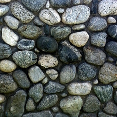
What you basically need is an image of a surface that has some realistic depth (such as stones, a wall or even a picture of a face). It is important that the image has dark and bright spots which indicate the structure. In my example the contrast between the stones (bright) and the spots between them (dark) helps us to determine the structure.
-
2
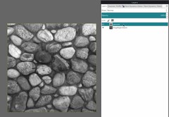
The next step is to prepare the mask that is used for the deformation.
Duplicate the surface layer, rename it to “gaussed” and blur the image using
- Filters / Gaussian Blur / 5 – 10px. Then desaturate using:
- Colors / Desaturate
Tip: The higer you blur the image (higher values) the softer will the distortion be at the end!
-
3
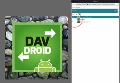
Disable the visibility of the “gaussed” layer.
Open any image that should be deformed and import it to you structure picture. The easiest way is to use
- File / Open as layers /
I opened the logo of our open source Android app “DAVdroid” for this example.
- File / Open as layers /
-
4
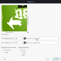
Important: You need to make your logo exactly equal-sized as the deformation mask. Otherwise you’ll be unable to choose the mask in the “Displace” filter. To achieve this select the logo layer and use the menu
- Layers / Layer to image size
Now we’re using the deformation mask to distort the image based on the structure.
- Use Filter / Map / Displace. (see values on the image)
Choose the deformation mask (“gaussed”) for X and Y. The X value displaces the image horizontally, Y does it vertically. The higher the values the more deformation you get. In most cases values between 10 and 30 will fit your needs. The “Polar” option instead of “Cartesian” deforms the logo towards the corners and edges. Just experiment with it!
-
5
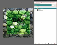
Now use the layer mode “Grain merge” to blend the logo layer with the background structure. You can also lower the opacity to around 70-80 if you feel the colors are looking too strong. This process will merge the contrast of the structure with the logo.
-
6
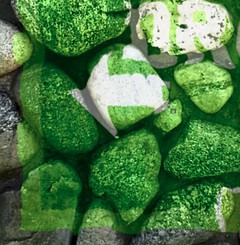
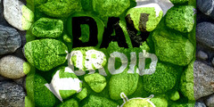
Now if we’re looking closer on the image you can see that the white arrow of the logo is “melting” over the stones. As intended the ground is a darker area which lets the logo sink down to it at the space between the stones.
-
7
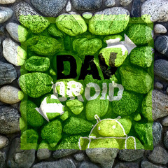
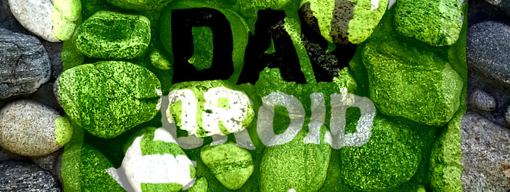
This is our final result. I hope you enjoyed this little tutorial ;)




Comments
Post your own comments, questions or hints here. The author and other users will see your posting and can reply to it.
Of course, you can also ask in the chat.
Subscription management
Please log in to manage your subscriptions.
User rating
This topic (Structure based deformation (adaptive distortion)) has been rated 4.8/5.0.
New comments are disabled because of spam.