Hybrid window mode - Challenging guiguru (not for real, but... read ahead)
This discussion is connected to the gimp-developer-list.gnome.org mailing list which is provided by the GIMP developers and not related to gimpusers.com.
This is a read-only list on gimpusers.com so this discussion thread is read-only, too.
| Hybrid window mode - Challenging guiguru (not for real, but... read ahead) | Kao | 08 Jan 14:09 |
Hybrid window mode - Challenging guiguru (not for real, but... read ahead)
I've been thinking about all the stuff around the new single-window-mode to be introduced hopefully in 2.8, and particularly got interested in guiguru's explanations of what this could be.
And I have things to say about that. The following will be a little sarcastic, because with all due respect, I know out of experience that it's hard to challenge a guru's opinion in people's mind when you are a newbie, so I have to do it both with arguments and bullets. Please consider that if I was yet seen as a trustworthy developer, I would have got rid of the bullets.
I will focus on this article describing the early _real_ concept of swm : http://www.mmiworks.net/eng/publications/2009/09/gimp-single-mode.html
I agree with the intro, the lack of a non overlapping window mode is a big issue and it needs to be solved, however there are people loving the good old multi window mode so it needs to be kept.
Then I don't agree with the assumptions made further, at the end of the
document guiguru states :
"But I actually expect that once single-window mode is out there, there will
be pressure from the community to have a look if multi-window mode cannot be
done a bit more, well, modern."
That really sounds like "let's do an awesome swm just for us, and those mwm morons will crave for it" [sarcasm, please don't jump on this] Of course this is invalidated by the introduction of new features from the swm redesign in mwm, such as multi columns dockables... but I don't buy the idea that you would voluntarily get rid of 50% of people's unconscious need for a better design that easily.
Three problems : - no tear off : I agree with that, image tear-off makes the usability all undefined... but hell, this does not mean multiple windows are dead. - no side-docking to multi windows : wtf ? There i totally disagree, this is inconsistent, and this would lead to maintain two parralel user interfaces because you weren't able to get them merged, and furthermore, this is a good example of what mwm morons (I am one of them) would crave for. - no image comparison : multiple windows can save you.
Tomorrow starts now :
Polaroids are introduced here.
Well, those mythic cameras are dead and it's really sad, but even if those
windows looks all vintage with their paper-white border, don't expect that
they will replace multiple windows efficiently. Moreover, what is the point
of making a non-overlapping design if you introduce MORE overlapping feature
as polaroids will not be handled by the window manager ?
Here you create special case #1 : viewers instead of gimp windows, dumbed down windows that you cannot work on. Viewers may be a useful feature for both swm and mwm users, but it's IMHO not the key feature for people who want to _work_ on multiple images/views at the same time.
the decline and fall of tabs :
Parade is introduced here.
Tabs are silly, I'm OK with getting rid of them. So you introduce the
not-that-recently well established concept of parade, a list of thumbnails
which will contain current works in progress and the history, all with their
colorful thumbnail, then the open status of an image starts to blur and blah
blah... Ok just split up that parade into opened images and history ones,
this is just Images and History dockables.
Here you create special case #2 : a new mandatory wasting space widget for a
concept that is already implemented in mwm gimp. Awesome. It can be hidden ?
Then what is the difference with a dockable ? Just merge existing ones and
enhance them.
It can be docked on every side of the image ? Look at mockups : people also
want a horizontal mode for nearly all dockables, and toolbox, maybe toolbox
first. Why creating such a special case ?!
Now let me introduce hybrid window mode.
Why do 50% of users not love mwm ?
- It's overlapping
- There are too many windows when too many images are opened
Why do 50 % of users love mwm ? - They can efficiently use their virtual desktops, or their dual monitors. - They can work on several images/views at a time
What you are doing with swm is create a new box for the first category,
without solving the problems that still exists for the second. Do you REALLY
believe that mwm users are NOT bothered by the same issues ? Do you REALLY
believe that swm future users wouldn't ever want to use dual monitors or
work on more than one image ?
I don't buy that. I don't buy a solution that is splitting up a community
instead of trying to solve problems for both.
Brainstorming :
Let's start from the actual swm design. There's tab or parade, whatever. You
can tear off dockables as you want.
Now as we seen it, parade is just a redesigned Images+History, so let's get
rid of that. What remains ?
A gimp image window, where dockables can be docked, and which is (KEY
FEATURE THERE :) DECOUPLED from the image it's aiming at. That is the thing
to conciliate mwm users ans swm ones on one point : too many windows. Don't
create a new window for every images, re-aim windows instead. That is a swm
behavior that mwm users WANT too, even if they don't want it enough to drop
mwm. Parade/Image swhitchin widget will then be kind of mandatory, but it is
really a better trade-off than losing the whole mwm power.
Tearing off windows : it's bad, undefined behavior and so on, but that was a limitation induced by Image/window coupling. Don't tear off images to expect a window coupled to this image, create a new window which can aim at ANY opened images instead. Then you only have to bother the active window.
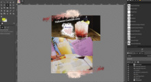
Who owns dockables ? Active window, you only work on it, you cannot work on an inactive window so the problem doesn't even exist : reparent them to the image displayed by the active window for docked ones, undocked ones keep their behavior (auto follow or not). This is almost explained by the following png : http://img696.imageshack.us/img696/9765/hybridwindowmode.png
Advantages :
- Less windows, only the necessary number of displays, not one for every
single image. There can be one (swm), two, three, with 1 or 10 images
opened.
- Non overlapping design accessible to all.
- We love virtual desktops and dual monitors
- No special cases features.
- Old school mwm can be handled only by recoupling Image to windows.
- One design to rule them, and in free software to bind them.
This would IMO efficiently merge swm and mwm, sharing advantages from both for everyone. That is a design I can buy.
Thank you for reading, apologies for bullets. Comments appreciated.
Damien.


