How to Sharpen Text with Background Transparancy
Hello!
I have designed a logo in Microsoft Word, I saved it as an image file.
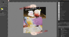
When I make the background transparent, the text is not right. The
transparency doesn't come close enough to the letters so white & grey
are showing on the edge of the black text. I have attached an example
of my situation.
A good example, it shows tthat the text is quite small, 16 pixels high.
Guessing that you used colour select to remove a white background and it has left some semi-transparent and off-white edge pixels. There is a threshold setting that might get a better result.
My process was to create it in word, snip the logo and save it as in
image in paint, and then bring it over to Gimp. Is there anyway I can
fix it so the text is sharp with no weird edging as it really makes
the logo look like crap. Should I be starting it in powerpoint or
publisher? I need two fonts that are not readily available so I need
to use these programs (and it's all that I have). Maybe I should be
saving them as a specific kind of image file?
Sharp with no weird edging (anti-alising - look it up) will look equally bad.
Shame you can not get the font(s). Word / powerpoint / publisher all equally bad for getting an image into Gimp. Avoid a lossy compressed format such as jpeg, .png is preferable but even bmp at a push. For logos a vector format such as SVG is best but that requires an application such as Inkscape.
I've been trying to correct this for hours tonight and have got
nowhere. It took me awhile to do the transparency, lol.
Any help would be massively appreciated - I have diagnosed ADHD which
makes searching around difficult, and I'm trying to help a friend out.
Use Colors -> Color-to-Alpha to remove the background color. White is default, can be changed.
Various ways to tidy up the text, Not writing reams of descriptions with this forum see if you can use anything from this 3 minute video.
https://youtu.be/mZdvvPXOKHo
best of luck


