RSS/Atom feed Twitter
Site is read-only, email is disabled

Text over light part of background is lighter than rest of text

This discussion is connected to the gimp-user-list.gnome.org mailing list which is provided by the GIMP developers and not related to gimpusers.com.

This is a read-only list on gimpusers.com so this discussion thread is read-only, too.

1 of 1 message available
Toggle history

Please log in to manage your subscriptions.

Text over light part of background is lighter than rest of text Infomaster 28 Mar 00:27
2014-03-28 00:27:50 UTC (over 10 years ago)
postings
1

Text over light part of background is lighter than rest of text

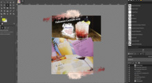
I have a background image that is about half brightness for a tri-fold brochure. Text is in layers over it. Most looks very good. Some of the text is over lighter areas of the background, while some is not. That text which is over the lighter background parts is lighter than the other text (on screen and printed), as if some of the background brightness is bleaching the text. What is the fix so that all the text has the same darkness?