Save Changes Integrated
This discussion is connected to the gimp-developer-list.gnome.org mailing list which is provided by the GIMP developers and not related to gimpusers.com.
This is a read-only list on gimpusers.com so this discussion thread is read-only, too.
| Save Changes Integrated | Thorsten Wilms | 18 May 14:30 |
| Save Changes Integrated | peter sikking | 18 May 15:41 |
| Save Changes Integrated | Thorsten Wilms | 18 May 16:48 |
| Save Changes Integrated | peter sikking | 18 May 17:38 |
| Save Changes Integrated | Thorsten Wilms | 18 May 20:33 |
| Save Changes Integrated | Thorsten Wilms | 18 May 21:16 |
| Save Changes Integrated | Sven Neumann | 20 May 15:29 |
| Save Changes Integrated | Thorsten Wilms | 20 May 16:20 |
| Save Changes Integrated | Sven Neumann | 20 May 16:29 |
| Save Changes Integrated | Thorsten Wilms | 20 May 18:17 |
| Save Changes Integrated | Christopher Curtis | 20 May 18:52 |
Save Changes Integrated
Hi!
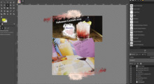
Image window and Save Changes dialog turned into one: http://thorwil.wordpress.com/2007/05/18/save-changes-integrated/
Save Changes Integrated
Thorsten,
Image window and Save Changes dialog turned into one: http://thorwil.wordpress.com/2007/05/18/save-changes-integrated/
Somehow I do not know what structural problem you are trying to solve for one million users.
I am all for reusing the main window (save for web, preparing a print) but not for this task.
--ps
principal user interaction architect man + machine interface works
http://mmiworks.net/blog : on interaction architecture
Save Changes Integrated
On Fri, May 18, 2007 at 03:41:39PM +0200, peter sikking wrote:
http://thorwil.wordpress.com/2007/05/18/save-changes-integrated/
Somehow I do not know what structural problem you are trying to solve for one million users.
The current Save Changes dialog tends obscure the image. If users would be damn sure about closing a window with unsaved changes every time, there would be no need for asking back. So the user should be able to see _what_ he's about to save or discard. The image itself is likely to be much more informative than filename and "changes from the last x minutes".
BTW, from my own experience, hitting Save when the prior version was actually better and something to be kept is much more of a danger than not saving something you wanted to keep.
Now that I write about it, another idea comes to my mind: The Save Changes window could have a toggle to display the last saved version.
The dialog is very closely tied to the image window, but still presented as its own window. Transforming the image window into a Save Changes window is as clear as you can get about the relation.
One can get rid of the visual noise of a dialog with titlebar and border and avoid obscuring the image in one go. So this removes unnecesary elements from screen, something that I think is quite helpful if you deal with several image windows.
Save Changes Integrated
Thorsten,
http://thorwil.wordpress.com/2007/05/18/save-changes-integrated/
Somehow I do not know what structural problem you are trying to solve for one million users.
The current Save Changes dialog tends obscure the image.
It is a modal dialog situation: we need a decision now.
The dialog is a (hopefully) friendly reminder that some of your last steps were not saved.
If users would be damn sure about closing a window with unsaved changes every time, there would be no need for asking back. So the user should be able to see _what_ he's about to save or discard. The image itself is likely to be much more informative than filename and "changes from the last x minutes".
I find this stress on looking at the image very worrying. What drives the decision is the state of mind of users: "these changes in the last xy minutes were useful/useless."
Either this state of mind is there, because the one just worked on the file, or it is not there, because one worked yesterday on the file. In that case I am not going to invite anybody to investigate that within a dialog. Back off (Cancel) and investigate with all of GIMP's capabilities, I say.
If I were to evaluate/improve the dialog, I would start with that state of mind.
BTW, from my own experience, hitting Save when the prior version was actually better and something to be kept is much more of a danger than not saving something you wanted to keep.
The first thing you have to do when you want to help one million users is to forget about yourself.
Now that I write about it, another idea comes to my mind: The Save Changes window could have a toggle to display the last saved version.
The dialog is very closely tied to the image window, but still presented as its own window. Transforming the image window into a Save Changes window is as clear as you can get about the relation.
I do not think so. First you have to realise that this "decide to save the unsaved" is an error scenario, a non-task if you will. You are building a full-fledged UI for a task that does not exist on users' radar screen.
That is a misfit.
One can get rid of the visual noise of a dialog with titlebar and border and avoid obscuring the image in one go. So this removes unnecesary elements from screen, something that I think is quite helpful if you deal with several image windows.
Having the dialog there is not a long-term situation, no? It may be jarring, but it needs to be, for a transient moment.
It is actually architecturally very worrying that you try to harmonise the dialog into the main window. It does not lessen the interruption in users workflow, and the overall presentation is more of a misfit of what is actually going on.
"Somehow I do not know what structural problem you are trying to solve for one million users."
--ps
principal user interaction architect man + machine interface works
http://mmiworks.net/blog : on interaction architecture
Save Changes Integrated
On Fri, May 18, 2007 at 05:38:19PM +0200, peter sikking wrote:
http://thorwil.wordpress.com/2007/05/18/save-changes-integrated/
It is a modal dialog situation: we need a decision now.
Yes, the scope being the image. Regarding that one image window, a decision is needed, outside not.
If users would be damn sure about closing a window with unsaved changes every time, there would be no need for asking back. So the user should be able to see _what_ he's about to save or discard. The image itself is likely to be much more informative than filename and "changes from the last x minutes".
I find this stress on looking at the image very worrying. What drives the decision is the state of mind of users: "these changes in the last xy minutes were useful/useless."
Either this state of mind is there, because the one just worked on the file, or it is not there, because one worked yesterday on the file. In that case I am not going to invite anybody to investigate that within a dialog. Back off (Cancel) and investigate with all of GIMP's capabilities, I say.
Ok, you have a point here.
The dialog is very closely tied to the image window, but still presented as its own window. Transforming the image window into a Save Changes window is as clear as you can get about the relation.
I do not think so. First you have to realise that this "decide to save the unsaved" is an error scenario, a non-task if you will. You are building a full-fledged UI for a task that does not exist on users' radar screen.
That is a misfit.
You never witnessed people using the dialog with the intention
of triggering a save and closing the window? I did. Of course
I have no numbers :)
Not that this changes anything here, I just thought "does
not exist on users' radar screen" is bold, if not wrong.
I think I understand your reasoning and maybe my proposal is
not good.
I'm not at all convinced about the presentation of this modal,
tied to another window while looking like any other window
itself dialog, though.
It already shares focus and minimising with the image window.
It being a semi-separate window is only good for moving it.
Moving it is only good for getting to see the whole canvas.
If it would not cover any part of the canvas, there would be
no need to move it. If there's never a need to move it, it
shouldn't be a semi-separate window.
Of course something could be done on a WM level, like not drawing it with a titlebar and placing it right below the image window menu bar or whatever placement would emphasize the connection.
Save Changes Integrated
On Fri, May 18, 2007 at 08:33:38PM +0200, Thorsten Wilms wrote:
http://thorwil.wordpress.com/2007/05/18/save-changes-integrated/
I'm not at all convinced about the presentation of this modal, tied to another window while looking like any other window itself dialog, though.
It already shares focus and minimising with the image window. It being a semi-separate window is only good for moving it. Moving it is only good for getting to see the whole canvas. If it would not cover any part of the canvas, there would be no need to move it. If there's never a need to move it, it shouldn't be a semi-separate window.Of course something could be done on a WM level, like not drawing it with a titlebar and placing it right below the image window menu bar or whatever placement would emphasize the connection.
http://thorwil.wordpress.com/2007/05/18/save-changes-integrated-2/
Save Changes Integrated
Hi,
On Fri, 2007-05-18 at 20:33 +0200, Thorsten Wilms wrote:
It already shares focus and minimising with the image window. It being a semi-separate window is only good for moving it. Moving it is only good for getting to see the whole canvas. If it would not cover any part of the canvas, there would be no need to move it. If there's never a need to move it, it shouldn't be a semi-separate window.
Well, you have overlooked the main problem here. If you add user interface elements to the image window, then these will cover parts of the canvas and there will be no way to unobscure the covered parts. So if you think that it may be important that the user has a chance to check the content of the image window, then a popup dialog is the only way to go.
Your proposal makes sense for some informational messages though. Things
such as the load plug-in informing you that it had to transform the
image from a different colorspace or that it wasn't able to interpret
some tags in the image file. Such messages could be nicely presented at
the top of the image window and this would probably be less annoying
than using a popup dialog for it. I suggested this a while ago already
but I found that it isn't implementable without changes to the plug-in
message API.
Sven
Save Changes Integrated
On Sun, May 20, 2007 at 03:29:37PM +0200, Sven Neumann wrote:
Well, you have overlooked the main problem here. If you add user interface elements to the image window, then these will cover parts of the canvas and there will be no way to unobscure the covered parts. So if you think that it may be important that the user has a chance to check the content of the image window, then a popup dialog is the only way to go.
No. Either being able to see the canvas is important, in which case
adding the message and resizing the image window can be better than
having the user move a window around. Even without resizing, scrollbars
could come o the rescue.
Or it is not important, so the window doesn't have to be resized and the
message can obscure part of it (which might be less drastic than the
dialog window jumping up right in the middle.
With a dialog window, I wonder if it would be better to place it top right, though. Close to the Close button.
Save Changes Integrated
Hi,
On Sun, 2007-05-20 at 16:20 +0200, Thorsten Wilms wrote:
No. Either being able to see the canvas is important, in which case adding the message and resizing the image window can be better than having the user move a window around.
There is nothing more annoying that a window that resizes itself. In particular because it is very difficult, if not impossible, to get this right with all the various window managers being used by our users. The window manager may even decide to completely ignore the resize request from the application.
With a dialog window, I wonder if it would be better to place it top right, though. Close to the Close button.
Placement of dialog windows is left to the window manager. And only because your window manager draws a Close icon in the upper right corner doesn't mean that other window managers do that.
Sven
Save Changes Integrated
On Sun, May 20, 2007 at 04:29:34PM +0200, Sven Neumann wrote:
There is nothing more annoying that a window that resizes itself. In particular because it is very difficult, if not impossible, to get this right with all the various window managers being used by our users. The window manager may even decide to completely ignore the resize request from the application.
With a dialog window, I wonder if it would be better to place it top right, though. Close to the Close button.
Placement of dialog windows is left to the window manager. And only because your window manager draws a Close icon in the upper right corner doesn't mean that other window managers do that.
I didn't meant to imply the GIMP should or could take care of this.
Taking all the feedback into account, here's another variation, now entirely targeted at the WM. Just so you know I'm not ignorant ;) I will try to raise this with the Metacity project.
http://thorwil.wordpress.com/2007/05/20/save-changes-integrated-3/
Save Changes Integrated
On 5/20/07, Thorsten Wilms wrote:
I will try to raise this with the Metacity project. http://thorwil.wordpress.com/2007/05/20/save-changes-integrated-3/
I don't think you want to go too far down this path. A significant portion of GIMP users run Windows and WMs other than metacity.
Back in the day, hitting '/' in Lotus 1-2-3 would present a menu at the top of the screen (Excel emulates this behavior to this day). I'm not sure I understand the problem with proposal 2, but perhaps replacing the menu Lotus-style would be agreeable.
Are there MacOS-type environments that put the GIMP menu at the top of the screen? That could be a hinderance to this idea.
Chris


