http://layers.gimp.org/ is Ugly
This discussion is connected to the gimp-developer-list.gnome.org mailing list which is provided by the GIMP developers and not related to gimpusers.com.
This is a read-only list on gimpusers.com so this discussion thread is read-only, too.
| http://layers.gimp.org/ is Ugly | Shlomi Fish | 29 Aug 11:30 |
| http://layers.gimp.org/ is Ugly | Roman Joost | 29 Aug 13:34 |
| http://layers.gimp.org/ is Ugly | Shlomi Fish | 29 Aug 15:58 |
| http://layers.gimp.org/ is Ugly | Alexandre Prokoudine | 29 Aug 17:09 |
| http://layers.gimp.org/ is Ugly | Sven Neumann | 30 Aug 08:19 |
| http://layers.gimp.org/ is Ugly | Sven Neumann | 30 Aug 08:09 |
| http://layers.gimp.org/ is Ugly | Marco Wessel | 29 Aug 16:47 |
| http://layers.gimp.org/ is Ugly | William Skaggs | 29 Aug 18:24 |
| 20060829100701.GA16466@gimp... | 07 Oct 20:24 | |
| http://layers.gimp.org/ is Ugly | Shlomi Fish | 29 Aug 12:24 |
| 20060829101400.GB16466@gimp... | 07 Oct 20:24 | |
| http://layers.gimp.org/ is Ugly | Shlomi Fish | 29 Aug 12:50 |
| http://layers.gimp.org/ is Ugly | Michael Schumacher | 29 Aug 18:08 |
http://layers.gimp.org/ is Ugly
Hi all!
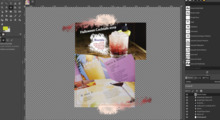
I'm afraid to say that http://layers.gimp.org/ is incredibly ugly, and makes us look very bad. As people who develop an image editing software we should have at least a bit of rudimentary aesthetic sense.
Carol told me she tried to make it look like the Layers dialog. Well, that's not what I'd like to see there, and even so with some CSS and images it can look much better. In any case, a web page can be even more visually appealing without trying to emulate a GUI dialog.
Other problems in the site:
1. There is no RSS feed as in the .
2. The tabs at the top ("Layers", "Paths", etc.) are cryptic and also their links don't contain the 'title=' attributes.
3. The title of the page just reads "GIMP Layers" without any explanation that we refer to an aggregated feed of the GIMP developers blogs.
4. There are no links at the side to the individual blog homepages and their feeds.
Please fix all that.
Regards,
Shlomi Fish
--------------------------------------------------------------------- Shlomi Fish shlomif@iglu.org.il Homepage: http://www.shlomifish.org/
Chuck Norris wrote a complete Perl 6 implementation in a day but then destroyed all evidence with his bare hands, so no one will know his secrets.
http://layers.gimp.org/ is Ugly
On Tuesday 29 August 2006 13:07, Carol Spears wrote:
On Tue, Aug 29, 2006 at 12:30:59PM +0300, Shlomi Fish wrote:
Please fix all that.
do you want me to remove your feed from that planet instance?
Carol, I already told you on the IRC that I don't want such a thing.
I don't want the GIMP planets to disappear or my feeds to be removed them. I think they are a very good thing to have. However, I do want their problems to be resolved, so everyone can enjoy them better.
Regards,
Shlomi Fish
--------------------------------------------------------------------- Shlomi Fish shlomif@iglu.org.il Homepage: http://www.shlomifish.org/
Chuck Norris wrote a complete Perl 6 implementation in a day but then destroyed all evidence with his bare hands, so no one will know his secrets.
http://layers.gimp.org/ is Ugly
CCed to the list because I hate it when people email me annoying emails in private, and expect private responses. (see: http://www.mail-archive.com/iglu-web%40iglu.org.il/msg01595.html )
On Tuesday 29 August 2006 13:14, Carol Spears wrote:
hello,
when i put together the people for the gtk+ planet, i limited it to only those who had contributed for the current version cycle.
I disagree with this strategy. First of all, because it may imply that people that did not contribute for the next version will be removed. And secondly, because many people contributed in the past and are worth mentioning.
ugly maybe is a better word to describe people who make minimum contributions and have maximum opinions and needs.
This is not the case for me. I've made many past and present contributions to the GIMP. And I never had maximum opinions and needs.
'not my taste' is better to describe web page formating.
Perhaps. But I believe most people will find it "not their taste", which in this case will make it "ugly". And the usability problems I've mentioned are perfectly objective issues.
And just to match my requests with code, if you'll give me a pointer to the code of the planet, I will perform the necessary changes.
Carol, will you stop being so annoying? You're doing more harm than good, your logic sucks, and you seem to have a grudge against the entire world. Please stop, or I'll recommend and support that you'll no longer have access to the gimp.org facilities, and that all posts from you to the gimp mailing lists will be moderated.
thanks for your continued contribution,
You're welcome.
Regards,
Shlomi Fish
--------------------------------------------------------------------- Shlomi Fish shlomif@iglu.org.il Homepage: http://www.shlomifish.org/
Chuck Norris wrote a complete Perl 6 implementation in a day but then destroyed all evidence with his bare hands, so no one will know his secrets.
http://layers.gimp.org/ is Ugly
Hi folks,
On Tue, Aug 29, 2006 at 12:30:59PM +0300, Shlomi Fish wrote:
I'm afraid to say that http://layers.gimp.org/ is incredibly ugly, and makes us look very bad. As people who develop an image editing software we should have at least a bit of rudimentary aesthetic sense.
Carol told me she tried to make it look like the Layers dialog. Well, that's not what I'd like to see there, and even so with some CSS and images it can look much better. In any case, a web page can be even more visually appealing without trying to emulate a GUI dialog.
Besides the technical problems, I think you should propose a new site layout than just pestering about the current layout.
I think 'ugly' is a very subjective term and if no one comes up with something better I wouldn't change anything in Carols position. This is similar to what GIMP users nag the developers about (Usability, Window Management, etc)
Greetings,
http://layers.gimp.org/ is Ugly
On Tuesday 29 August 2006 14:34, Roman Joost wrote:
Hi folks,
On Tue, Aug 29, 2006 at 12:30:59PM +0300, Shlomi Fish wrote:
I'm afraid to say that http://layers.gimp.org/ is incredibly ugly, and makes us look very bad. As people who develop an image editing software we should have at least a bit of rudimentary aesthetic sense.
Carol told me she tried to make it look like the Layers dialog. Well, that's not what I'd like to see there, and even so with some CSS and images it can look much better. In any case, a web page can be even more visually appealing without trying to emulate a GUI dialog.
Besides the technical problems, I think you should propose a new site layout than just pestering about the current layout.
I think 'ugly' is a very subjective term and if no one comes up with something better I wouldn't change anything in Carols position. This is similar to what GIMP users nag the developers about (Usability, Window Management, etc)
Well, we can use any of the following designs, which are much better:
* http://www.planetapache.org/
I recall seeing even better looking planets in my neverending web surfing. Plus, we can always re-use a theme of WordPress or whatever.
Regards,
Shlomi Fish
--------------------------------------------------------------------- Shlomi Fish shlomif@iglu.org.il Homepage: http://www.shlomifish.org/
Chuck Norris wrote a complete Perl 6 implementation in a day but then destroyed all evidence with his bare hands, so no one will know his secrets.
http://layers.gimp.org/ is Ugly
On Aug 29, 2006, at 3:58 PM, Shlomi Fish wrote:
Well, we can use any of the following designs, which are much better:
* http://www.planetapache.org/
I recall seeing even better looking planets in my neverending web surfing.
Plus, we can always re-use a theme of WordPress or whatever.
I personally much prefer the current custom, unique layout than ripping either one of those (or any other, for that matter) sites' layouts or simply taking a wordpress theme and adapting it.
I don't necessarily agree with the current one being "ugly", per se, though I agree it needs some work. Mostly it's too bulky. I like the idea of making it look like a layers dialog a lot.
Regards,
Marco Wessel
http://layers.gimp.org/ is Ugly
On 8/29/06, Shlomi Fish wrote:
Well, we can use any of the following designs, which are much better:
* http://www.planetapache.org/
I recall seeing even better looking planets in my neverending web surfing. Plus, we can always re-use a theme of WordPress or whatever.
Then there is no sense in naming the planet "layers" anymore. I agree that implementation could be better, though I can even imagine how exactly within current approach).
Alexandre
http://layers.gimp.org/ is Ugly
Von: Shlomi Fish
On Tuesday 29 August 2006 13:14, Carol Spears wrote:
when i put together the people for the gtk+ planet, i limited it to only those who had contributed for the current version cycle.
I disagree with this strategy. First of all, because it may imply that people that did not contribute for the next version will be removed. And secondly, because many people contributed in the past and are worth mentioning.
IMO it is worth mentioning that we did discuss a similiar distinction for the GIMP about dialog during LGM. Right now, it looks like GIMP has a huge amount of active developers. This may explain why some people think that we're turining down enhancement requests because we don't like them, while the reason is we just don't have the manpower. So carol's trategy doesn't sound like the worst possible metric to me.
Likewise, the feeds provided at gimp.org should be about people involved with GIMP. Originally there was one feed for the active developers and and for active users. IMO it should also be limited to posts in the respective person's gimp- or graphics-related categories. For example, we do not need to relay conspiracy theories or nationalist thoughts.
Regards, Michael
http://layers.gimp.org/ is Ugly
From: Shlomi Fish
I'm afraid to say that http://layers.gimp.org/ is incredibly ugly, and makes us look very bad. As people who develop an image editing software we should have at least a bit of rudimentary aesthetic sense.
If this were a bug report, the first thing we would do is demand that the bug reporter apologize for using such unnecessarily abusive language, and explain that antagonizing people is not the way to get a problem fixed.
Well, it *is* a bug report!
-- Bill
______________ ______________ ______________ ______________
Sent via the CNPRC Email system at primate.ucdavis.edu
http://layers.gimp.org/ is Ugly
Hi,
On Tue, 2006-08-29 at 13:34 +0200, Roman Joost wrote:
Besides the technical problems, I think you should propose a new site layout than just pestering about the current layout.
That's of course correct but Shlomi has a point here. The pages that he mentioned look vastly different than the rest of the site. Whether you call them ugly (I do) or not, they are definitely different and contribute a lot to the inconsistency of the current website.
I really hope that at some point a group of people will take the challenge to redo the whole plethora of gimp.org websites and attempt to unify them. Currently it is very difficult for our users and (potential) developers to locate the information they are looking for.
The right place to discuss this is probably the gimp-web mailing-list.
I think 'ugly' is a very subjective term and if no one comes up with something better I wouldn't change anything in Carols position. This is similar to what GIMP users nag the developers about (Usability, Window Management, etc)
Carol isn't even in the position to change anything. As far as I remember she quit development of the website years ago and personally, I would welcome if she stayed out of it completely. At the moment, noone is actively working on gimp.org besides occasional maintainance by a handful of people.
Sven
http://layers.gimp.org/ is Ugly
Hi,
On Tue, 2006-08-29 at 19:09 +0400, Alexandre Prokoudine wrote:
Then there is no sense in naming the planet "layers" anymore. I agree that implementation could be better, though I can even imagine how exactly within current approach).
There has never been a good reason to call it "layers". The naming and design has also never been discussed here or on the gimp-web list. It just happened to be done. Which is often good. In this particular case though, I don't think that the result is very useful.
Sven


