RSS/Atom feed Twitter
Site is read-only, email is disabled

Pro interface theme

This discussion is connected to the gimp-developer-list.gnome.org mailing list which is provided by the GIMP developers and not related to gimpusers.com.

This is a read-only list on gimpusers.com so this discussion thread is read-only, too.

4 of 4 messages available
Toggle history

Please log in to manage your subscriptions.

Pro interface theme Johann 09 Jun 18:06
  Pro interface theme Alexandre Prokoudine 11 Jun 07:24
   Pro interface theme Kevin Cozens 28 Jun 14:57
    Pro interface theme Alexandre Prokoudine 28 Jun 15:41
Johann
2014-06-09 18:06:21 UTC (over 10 years ago)

Pro interface theme

Hi,
i'd suggest a nicer User interface:

Dark from theme: Pro Tiny icons from theme: small
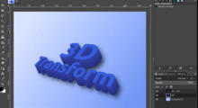
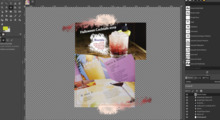
Blue highlights from theme: Aqua, i think? (see attachments: loading bar, tool bar highlights)

Please add transparency to the splash screen! (strange, that the png-splash screen uses no alpha channel but the colors from the actual theme-see the round corners in my splash screen)

have a nice day! jo

Alexandre Prokoudine
2014-06-11 07:24:59 UTC (over 10 years ago)

Pro interface theme

On Mon, Jun 9, 2014 at 10:06 PM, Johann wrote:

Hi,
i'd suggest a nicer User interface:

Dark from theme: Pro

https://plus.google.com/u/0/+AlexandreProkoudine/posts/LP1pWr7YEgA is a preview of what's coming.

Alexandre

Kevin Cozens
2014-06-28 14:57:23 UTC (over 10 years ago)

Pro interface theme

On 14-06-11 03:24 AM, Alexandre Prokoudine wrote:

https://plus.google.com/u/0/+AlexandreProkoudine/posts/LP1pWr7YEgA is a preview of what's coming.

Is that the general look for a future GIMP for both single and multiple window modes?

Cheers!

Kevin.

http://www.ve3syb.ca/           |"Nerds make the shiny things that distract
Owner of Elecraft K2 #2172      | the mouth-breathers, and that's why we're
                                 | powerful!"
#include  |             --Chris Hardwick
Alexandre Prokoudine
2014-06-28 15:41:49 UTC (over 10 years ago)

Pro interface theme

28 июня 2014 г. 18:58 пользователь "Kevin Cozens" написал:

Is that the general look for a future GIMP for both single and multiple

window modes?

I have no foggiest idea what modes have to do with anything, but yes, it's close to the outcome (I did not replace some of the icons with monochrome ones).

Alex