Paths need better display of on-canvas transform tools
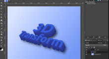
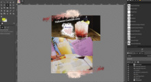
I was using the Perspective Distortion on a path-from-text the other day when I noticed a usability gripe: The tool's on-canvas preview (i.e. the transformation handles and guides) used the entire image canvas size. Although it did display an on-canvas preview of the path being transformed, the particular skew I was looking for required stretching the transformation handles well outside the bounds of the image canvas -- not exactly convenient when the path in question occupies a relatively small portion of the entire image canvas.
For comparison, when you use a transform tool on a layer, GIMP uses the bounds of that layer for the preview grid (if a selection is present, GIMP also limits it to the layer's selected area). Likewise, if you use a transformation tool on the selection mask itself, GIMP also uses the rectangular bounds of that selection.
But when you use a transform tool on a path, GIMP should grab the rectangular bounds of the path you are modifying and base its preview (transformation handles and guides) on that. Much more intuitive that it's modifying a path, not the whole image.
-- Stratadrake
strata_ranger@hotmail.com
--------------------
Numbers may not lie, but neither do they tell the whole truth.


