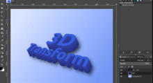
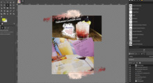
unified transform tool
Thanks Peter and Johan for the answers!
I have not got 2.9 running at the moment, but googling screenshots
showed that the tool icon is at the moment totally not what it
should be.
Well, that's something that was puzzling my mind: How an icon for
unified transform would look like? I was even trying it out as an art
exercise :) If it showed all of the arrows that its related to - scale,
rotate, etc. the icon would be a mess. A clever solution for this will
be a good art example, I think!
also I see that the tool options have become the victim of bloat
in the meanwhile. it was probably all well intended. it is up to
me to work with the developer and clean that up.
Talking about bloating, i thought that all the tranform options in the
grid (squares, losangles, losangues inside squares) are kinda visually
overwhelming at first sight. Don't know if that actually is a problem,
but I guess a more clean look would be better... although that would
maybe imply a more complicated tool, with hiding and showing transform
options. Well, that's something to give a thought about, I don't a see a
simple way of doing it right now..
Thanks again everyone,
Thiago


