[HTML version of this posting: http://yahvuu.wordpress.com/2012/10/16/single-pixel-width-outlines-with-anti-aliasing/ ]
Hi,
here's how good old XOR drawing can be anti-aliased in order to better meet today's
aesthetic standards. In GIMP terms:
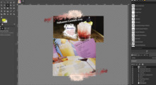
Duplicate the layer, invert it and simply perform the outline drawing on the layer mask.
Examples (created with a slightly more elaborate scheme, see below):
http://yahvuu.files.wordpress.com/2012/10/sharp-antialias-overlay1.png
http://yahvuu.files.wordpress.com/2012/10/sharp-antialias-overlay2.png
What's wrong with the current 3-line outline style?
Ideally, outlines should be much thinner than the desired resolution of the
adjustment. Note how the tick marks of a ruler are much thinner in dimension
than the resolution of the ruler. Roughly 1/10 of a millimeter thin marks for
a ruler with 1mm resolution.
Now one could rely on the trend towards higher screen DPIs which will gracefully
let the 3-line outline appear accurate enough in near future. Fair enough -- but
then a new problem will show up: when the three lines can no longer be visually
distinguished, they will appear as an overlay of a single gray line. Which in turn
does not provide enough contrast in all situations.
You may simulate the effect of high DPIs by stepping back while looking at the
following test image. One of the vertical outlines will blend into the background
(which one, depends on your monitor gamma):
http://yahvuu.files.wordpress.com/2012/10/fatlines-fading.png
Which color should the single-pixel outline have?
The ideal outline contrasts both the surrounding pixels and the underlying
pixels in any situation. But which color gives the best contrast?
The W3C recommendations for contrast between text and its background [1]
seem close enough here -- what is good for reading performance can only be
good for outline recognition.
It turns out that pure black and white pixels yield the highest contrast ratios.
Brightness contrast beats color contrast. Which nicely matches the GUI attitude
to let the colorful pixels to the user, not to the application.
In summary, this gives the following steps:
1) Calculate luminance of underlying pixels
2) Threshold to black and white
3) Invert
4) Mask by desired outline
(Regrettably, contrast to surrounding pixels is not taken into account here)
What's wrong with these black'n'white outlines?
The harsh contrast edges can be distracting. This problem apppears most
prominently when moving an outline, in particular over smooth image regions
which are just about as bright as the threshold. You may try this Flash demo
https://sites.google.com/site/yahvuu/stuff/antialiasoverlay.swf?attredirects=0
or try moving the layer mask of the upper layer of the following XCF:
https://sites.google.com/site/yahvuu/stuff/outline-tester.xcf.zip?attredirects=0&d=1
Still way to go, but it's a start...
-yahvuu
[1] http://www.w3.org/TR/UNDERSTANDING-WCAG20/visual-audio-contrast-contrast.html, see also
http://www.w3.org/TR/2010/NOTE-WCAG20-TECHS-20101014/G18
http://snook.ca/technical/colour_contrast/colour.html


