Gimp-developer Digest, Vol 71, Issue 24
This discussion is connected to the gimp-developer-list.gnome.org mailing list which is provided by the GIMP developers and not related to gimpusers.com.
This is a read-only list on gimpusers.com so this discussion thread is read-only, too.
| mailman.203605.1219527005.1... | 07 Oct 20:26 | |
| Gimp-developer Digest, Vol 71, Issue 24 | Anke Lange | 24 Aug 00:05 |
Gimp-developer Digest, Vol 71, Issue 24
Well, the thing I like most on Gimp is that you can squasch and squeeze it the way you want.
I teach classes for adults how to use Gimp. And the first thing my pupils do is to learn how to insert new dialogs and how to optimize the toolbox.
I work with a beamer in my classes and most of them have a resolution of 800 x 600. So most of the time there does no picture fit between the two dialog-boxes. So I tend to place the tollbox in a long line above the picture-window and place the tool-options in the top of the dialog-box. That gives me at least a bit of space to open a photo.
I know, that a lot of people have different needs, so it's realy only a case of making it as flexible as possible. The dialog-boxes on the left side is a very good idea in my opinion. I made the same experiences with windows users. The fist thing they do is closing the dialog-box
Just my 2cents
Anke
gimp-developer-request@lists.XCF.Berkeley.EDU schrieb:
Send Gimp-developer mailing list submissions to gimp-developer@lists.XCF.Berkeley.EDU
To subscribe or unsubscribe via the World Wide Web, visit https://lists.XCF.Berkeley.EDU/mailman/listinfo/gimp-developer or, via email, send a message with subject or body 'help' to gimp-developer-request@lists.XCF.Berkeley.EDU
You can reach the person managing the list at gimp-developer-owner@lists.XCF.Berkeley.EDU
When replying, please edit your Subject line so it is more specific than "Re: Contents of Gimp-developer digest..."
Today's Topics:
1. Re: Proposal new default layout starting 2.6 (Alexia Death) 2. Re: Proposal new default layout starting 2.6 (Guillermo Espertino) 3. Re: Proposal new default layout starting 2.6 (gg@catking.net) 4. Re: Proposal new default layout starting 2.6 (Alexia Death) 5. Re: Proposal new default layout starting 2.6 (Sven Neumann) 6. Re: Proposal new default layout starting 2.6 (Sven Neumann) 7. Re: Proposal new default layout starting 2.6 (Guillermo Espertino)
----------------------------------------------------------------------
Message: 1 Date: Sat, 23 Aug 2008 22:29:40 +0300 From: Alexia Death
Subject: Re: [Gimp-developer] Proposal new default layout starting 2.6 To: "gimp-devel"
Message-ID:
Content-Type: text/plain; charset="iso-8859-15"On Saturday 23 August 2008 13:19:35 Sven Neumann wrote:
Hi,
On Sat, 2008-08-23 at 11:18 +0300, Alexia Death wrote:
In my opinion this layout(thin toolbox, one large dock) is preferable to first time users. It has familiarity. They wont feel lost when GIMP loads for the first time.
For a new GIMP user it is crucial that the tool-options are always fully visible and your proposed setup does not meet this simple criterion.
Tool options can be locked in place as the top of the dock set and that criterion is filled. Toolbox locked tool options do not serve that purpose any better. That little bit you save in scrolling if you dock your tool options under toolbox is in my opinion hardly worth the space a second full- width docker takes from the space reserved for the primary objective, working on your image.
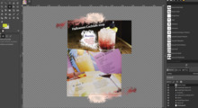
I think I need to state that my image was not an "exactly like this" proposal. There are altogether three points it tries to make. First, the image window needs to be incorporated into the default layout. Second, two dock sets take too much space(literally, on a smaller screen with two docks they can take up 2/3 of the screen.) and third, a bit of familiarity for the first time users(separate, 2 line toolbox) can not hurt. Yes, tool options need to be visible by default and so does layers dialog, I agree... But that is secondary to the generic layout.
------------------------------
Message: 2 Date: Sat, 23 Aug 2008 16:44:40 -0300 From: Guillermo Espertino
Subject: Re: [Gimp-developer] Proposal new default layout starting 2.6 To: gimp-developer@lists.XCF.Berkeley.EDU Message-ID:
Content-Type: text/plainIf you check this list's log you'll learn that the layout you suggest has already been proposed about a year ago. I know because I did it.
Later I proposed that layout again in my brainstorm entry about the no-image-open dialog.I used that layout for several months, but I changed my mind. And now I'm using a totally different one.
http://www.ohweb.com.ar/screenshots/one-window-layout.png
The screen space usage is addressed too, and I have all in one (I have one window button less in the bottom panel with gimp 2.4, and that's good). This shows that a single problem may have more than one solution (although this solution has the disadvantage of being only useful with high screen resolutions).
One of the Gimp's strengths is being able to customize the UI to have your layout, my layout and differents layouts, depending on what are your needs.
But, in other hand, Gimp has a problem with it's default layout (in my oppinion). And it's not the lack of familiarity with photoshop or whatsoever.
They tell us that this layout is better for new users, but every new user I know (mostly when they come from windows) the first thing they do is closing the right docker (trying to close the program). And they loose it forever (they have to re-construct it if they want it back). That's overkill.
That's one of the things that make gimp's UI look weird for newcomers. And that's frequently a problem with multiple windows UIs. You don't know what X closes the program and you end up closing other windows.I'd try to address this problem instead of thinking on mimicking other programs UIs looking for "familiarity".
------------------------------
Message: 3 Date: Sat, 23 Aug 2008 21:51:51 +0200 From: gg@catking.net
Subject: Re: [Gimp-developer] Proposal new default layout starting 2.6 To: alexiadeath@gmail.com, gimp-devel
Message-ID:
Content-Type: text/plain; format=flowed; delsp=yes; charset=iso-8859-1On Sat, 23 Aug 2008 21:29:40 +0200, Alexia Death wrote:
and third, a bit of familiarity for the first time users(separate, 2 line toolbox) can not hurt.


