RSS/Atom feed Twitter
Site is read-only, email is disabled

Tutorial: What's new in GIMP 2.6?

Written by , translated by redforce · Created on Jul 08, 2008, last updated almost 14 years ago CC BY-NC License

Motivation

For GIMP 2.6, the developers had a strong focus: the implementation of GEGL should replace the old GIMP core. These changes are mainly invisible to the common user, but besides that many other very useful things have been done to help users in the future. This preview gives you an overview of what has been done for GIMP 2.6. (SVN: 08 Jul 2008)

Tutorial details

  • Category: Basics
  • Time to reproduce: ≈15.0 minutes Skill_0
  • Tested with GIMP 2.6
  1. 1

    GEGL & a change in graphical user interface (UI)

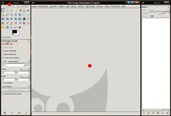
    The main focus for GIMP 2.6 was the implementation of GEGL. While most users won’t notice the changes under the surface, some things can be seen clearly:

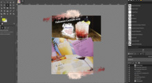
    The duplicate file menu entries (one in the toolbox and one in the image window) are gone. From now on, only one file menu will be displayed in the image window, so there’s always at least one window opened which contains the entry, even if there is no image open (then a grey container is displayed).

  2. 2

    Excellent: The heavily enhanced free selection tool

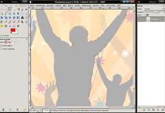
    Free Select has been improved! You have the possibility to select using free hand and combine this selection with polygons that you set by clicking instead of moving the mouse. So you can easily combine round free hand selections with straight lines.

    If you are in the making of a selection you can move your mouse over a part of the selection and re-adjust the points you set by dragging them. It’s now used a little more like the paths-tool. You can also hold CTRL on your keyboard to get straight lines in a 15°-angle.

    When you want to end a selection you can click the starting point – then the selection is displayed on the screen! It’s a truly excellent selection feeling!

  3. 3

    Please notice: The new text tool may probably not be implemented in 2.6. If the tool is not getting a final touch-up, we will see the old text tool of GIMP 2.4 in GIMP 2.6.

    NEW Usability-Feature for the text tool

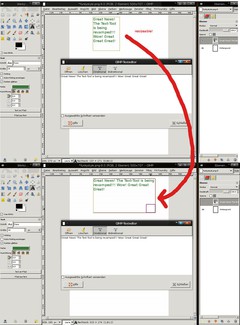
    Finally: The developers have started to enhance the text tool! In the current version you can create a text layer and change its size by drawing a text rectangle. In this rectangle, the text is written through a dialog box (which hopefully is replaced by direct on canvas editing somewhen in the future). Right now it is however already very useful, because you don’t have to make manual breaks – they’re done automatically when the text comes to the right border of the rectangle.

    And the best is: you can adjust the rectangle anytime!

  4. 4

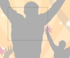
    The center of moved selections or layers is now displayed through a little cross in the middle. Also this cross is magnetic when you use grid and / or rulers.

  5. 5

    The status bar has been improved: It displays more information now – for example the aspect ratio of a drawn up rectangle selection is now displayed – and of course you’ll see many other information when using other tools.

  6. 6

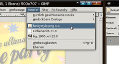
    Menu bar: The “Dialogs” are replaced with the “Windows”-entry. In the new Windows entry you can dock/undock dialogs and you can switch between all open windows. You don’t have to use the task bar anymore.

  7. 7

    Curves improved

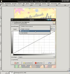
    In the Colors / Curves dialog you’ll be able to save your own curves now for future use. This is very usefuly if you have more than one image that needs the same curve to be adjusted.

    You can save them with a name and load them in a very simple drop-down way.

  8. 8

    ]

    If you take a screenshot with GIMP’s built-in screenshot tool you now have the option to save the mouse pointer into a seperate layer.

    This is cool, because if you need to demonstrate some other parts on the shot you can simply drag the pointer to another position – or you can just make it invisible without altering the original shot.

  9. 9

    Optional GEGL support

    You can choose if the color operations shall be rendered with the new built in GEGL core or with the old GIMP core.

  10. 10

    At the Zoom drop down you’re able to enter own and specific values now (i.e. 105%).

  11. 11

    The Scale-Tool does have a opacity ruler in the options of the tool (not in the popup). This helps you to see what’s behind the scaled layer.

  12. 12

    NEW & Cool: Brush-Dynamics

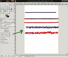
    Formerly the pressure values in the brushes mostly affected the users with graphics tablets. Now the options have been greatly increased.

    This is very usefuly for painters, for example. You could now use a speed-option to determine a special for a brush. A special is for example that a brush is losing opacity while moving very fast, or you could add an option that changes the brush size while moving very fast.

    This is definately a cool new improvement of the brushes.

  13. 13

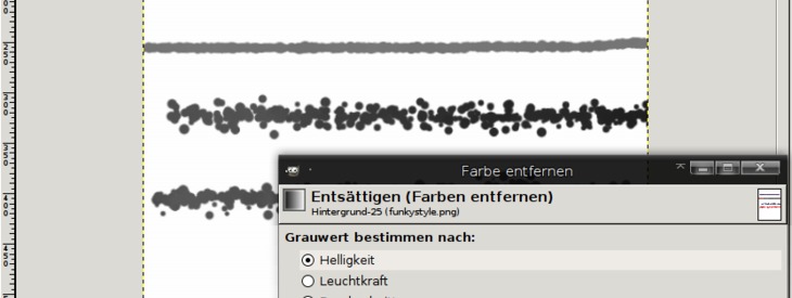
    Desaturate with a preview

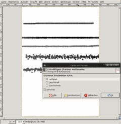
    The Colors / Desaturate Filter is now called a tool – which makes it possible to have a live preview of the desaturated image in the background.

  14. 14

    Even more changes:

    • The Flames Plugon gets 22 new variations
    • Alpha to Logo Scripts improved
    • Preferences: Folders Brushes, Fonts, etc. are now searches recursively, so the sub directories are not left out
    • The smear tool now uses scalable brushes as well
    • Smaller and clearer tool options
    • Whirl and Pinch has a bigger radius now
    • the Photoshop (PSD) file import plugin has been rewritten from scratch and offer much more options and improvements
    • Printing: The page setup is now an own option (it has been taken out of the print dialog)
    • New hotkey to set the default value of a sclable brush (Backspace)

    And of course there are many many more changes, mostly of technical nature!

    A preview version of GIMP 2.6 should be released somewhen in July, however the final release will probably be in august.

    Big Features, such as 16 Bit color support or native CMYK color space are not included in GIMP 2.6, however with the implementation of GEGL the road is now clear to develop such features in upcoming versions. Hopefully in 2009 with GIMP 2.8.

Comments

Post your own comments, questions or hints here. The author and other users will see your posting and can reply to it.

Of course, you can also ask in the chat.

Subscription management

Please log in to manage your subscriptions.

User rating

This topic (What's new in GIMP 2.6?) has been rated 3.0/5.0.

New comments are disabled because of spam.

Gwen
over 14 years ago

I need to know how to get my original menu options back (brushes and one color to show what has been seleted, not both the foreground and background color.) They disappeared, and I don't know what I did? Can someone please help?

content_writer member for over 15 years content_writer 5 comments
almost 15 years ago

Hi Jason,

If you are looking for a good "photo-work-only" program, I'd suggest you'd try IrfanView. It's easy to use, as-is, and it does croping, resizing and more. The color correction options are not as good/extensive as Gimp, in my opinion, but since everyone has their preferences, it might be good for you.

Batch operations in IrfranView cannot be any more complete or easier (when you click Advanced in Batch Conversion)--click a few checkmarks and you're done.

Don't get me wrong, for every function (except Batch), I prefer GIMP. Also it has no graphics creation tools. I'm only suggesting this alternative so you don't write off open-source programs completely.

Jason Saggers rated this topic with 1/5
almost 15 years ago

This program seems to get worse and less user friendly with each release.
On my laptop (vista 32bit) I have never been able to load this program at all, lots of program errors etc.
Why can't we minimize this program, why is it always on top, I am tired of loading plugins all the time, the save for web feature isn't very affective,
Why is this program split and not in one window, this drives me crazy.
I find my self using vista paint program more and more...
All i want is a single window program that is on the bottom, you can minimize and has features like crop, resize and high quality batch options.

Kevin rated this topic with 5/5
almost 15 years ago

The button the front page of gimpusers.com says "Preview" -- rather misleading, dontchathink?

Brian
almost 15 years ago

Woe is me, I am undone!(Isaiah) I have installed 2.6.8 while in the middle of following a tutorial. Now I have to close the toolbox, layers and any other windows (apart from what I'm working on) to make space for the source doc. - they used not to insist on remaining on top! Then I was able to leave at least a corner of each exposed to click on when needed.
And why only a combined icon on the task bar? That was always an alternative when a window had accidentally become obscured. I suppose the two problems go together?
And as a matter of interest, how does one open a new window now? The menu has been removed from the basic unit (aka the toolbox).

Stephen Davison
about 15 years ago

A few extra details re last post.
I am a windows user( both Vista and XP)
Gimp version (2.6) tried is 2.6.6
Also with regards to new UI the toolbox and layers dialog apear to float infront of the image window all the time so any overlap obscures part of the image window. This may be usefull to some but should be an option. After all some say th UI allows great flexibility. This latest version is a reduction in flexibility in my view. Hpe I have not duplicated others comments.

Stephen Davison
about 15 years ago

Love the Gimp in general, however a few comments regarding 2.6 release and others.

1 the new UI in release 2.6 is verry cumbersome for me as I often minimize the toolbox and layers dialogues. Minimize button is missing from 2.6 UI and moving windows off screen manually is not on. For the moment I am remaining on 2.4.7. Hope to see this rectified soon.

2. While lots of the suggestions for improvement are well and good (esp 16 bit), I see the most important as macro recording and an improved macro language as default.
I have a programming background an I find script fu most infuriating. For most non programmers they would just throw up thier hands in horror and walk away. Python scripting may be somewhat beter but this is non standard and in any case the average use should not need to be involved with the scripting language at all. Please Please Please consider maro(script) recording for future releases.

Overall an excellent product well done to all.

content_writer member for over 15 years content_writer 5 comments
over 15 years ago

Mike,

If you are talking about the blank line on the toolbox window, it has a purpose.

If you have a picture that you want to edit in gimp, you simply drag it onto that spot.

Personally, I don't see what the value of that function is--it would have been better if that was a shortcut to open the image as a new layer.

mike
over 15 years ago

I don't like the new changes. The biggest issue for me is that the super-tool-and-layers window simply doesn't fit properly on my small laptop screen. For no real reason. And the custom 'tab' system doesn't behave like I expect - if I could collapse the other tool views rather than being forced to close all but one, it might be ok.

And why the blank line where the menu used to be? Ugly waste of space.

Pigeon member for over 15 years Pigeon 5 comments
over 15 years ago

"It is not possible to the get the old style back."

Aaargh...

I shall be having a look at the source code, then... investigating how possible it is to patch the old code back in.

devvv member for about 18 years devvv 1475 comments
over 15 years ago

It is not possible to the get the old style back. However the UI will be improved further - 2.6 is only a middle step to the new UI. I trust the developers that they know what they're doing - they already know that many people don't like it the way it is in 2.6. So please be patient - we all have to wait for 2.8+ ;)

Pigeon member for over 15 years Pigeon 5 comments
over 15 years ago

The UI changes suck. The default blank image window is annoying and I want rid of it. And having the File menu missing from the toolbox window is infuriating - especially as there seems to be no method provided to put it back. "Because photoshop does it" is not a good enough reason - one program having a crap UI is not a reason to change the UI of a totally unrelated program to also be crap. How does one get this back the way it used to be?

htrod
over 15 years ago

I tried saving a 500 frame
clip in xcf format using the
video option in gimp 2.6 but
i have only been able to save
a wav file....does anyone
know the exact steps or what
i may be doing wrong?

ctbs1999
over 15 years ago

As a novice researching the capabilities, I have found this article very imformative.

Can anyone suggest good novice tutorials for gimp 2.6 as the current ones do not appear to match the interface, nor the command sequences.

mamboze member for almost 16 years mamboze 15 comments
almost 16 years ago

@ devvv, thanks, I'll give it a go

devvv member for about 18 years devvv 1475 comments
almost 16 years ago

it's not automatically aligned like this, i did it myself. but a good suggestion if you use linux: right click a window (toolbox / layers) and set it to stay on front. its relly helpful imo

mamboze member for almost 16 years mamboze 15 comments
almost 16 years ago

Here's a plea from a gimp noob. I'm running gimp 2.6.3 on Ubuntu Intrepid. How do you get that cool UI shown in
GEGL & a change in graphical user interface (UI) 1.
On my machine, gimp comes up with separate dialogs.

reko tornberg
almost 16 years ago

gimb is the best

mcKidney
almost 16 years ago

About MultiWindow: Actualy single windows is a thing of past, even photoshop stop using it a long time ago. Learn something about the technology, or your expression skills (Or perhaps click and move on some of your toolbars)
Only difference in Gimp and PS(Or MS Office for that matter) is lack of own windows management(And that is not really a problem of Gimp, but rather whole implementation of graphic library in windows). It means your other Windows Manager functions must take care of it. This is a problem only in MS Windows (Or maybe MacOSX), where such control is not implemented by default.
If u are using linux and complaining about windows going in your way, then learn a very easy way to make them behave exactly like PS.
Bitching about it only makes u look stupid.

I was hoping for some of those changes, there are still things I would like to see in the interface part. (User-Friendly editions, for example profiles with different approach for the whole editing) EDIT: I know most of it can be done by scripting

And one thing, but i am not sure if it is a problem of gimp, but i rather disturbed by Brush cursor leaving marks over the picture.

Riccardo
almost 16 years ago

"give the people who like the GIMP's simple and flexible interface an option in the preferences to revert to GIMP Classic. Thank you."

Yess!
I think the same way! All the blabla about cmyk, 16 bit and layers... are unuseful. I believe that these things are to be done, but in a correct way, not in a hurry. If they take time... I'll wait, I'm not able to do that, so I patiently wait.

For what regards the interface... I absolutely agree with the NEED and URGE to keep floating windows! They are necessary if (as I do) one uses two screens. I don't need multiple desktops on my box, I have two 20'' monitors, and keep the tools on the right and the full screen image on the right.

To the person who wrote it's an old fashioned way of programming... I say that it was a good way. Have a look at the autocad interface...

andotyjazz
almost 16 years ago

@D.J. - Is this what you are trying to find? http://img380.imageshack.us/img380/1033/screenshotgimp26bs0.png

D.J
almost 16 years ago

Coming from 2.4 to 2.6.2. Anyone know where the "Xtns" menu item and the items below it went? It was part of the File menu on the Toolbox. Under script-fu there were menu items: buttons, logos, misc, patterns, web page themes, and utils. I did find the plug-in browser under the Image window Help menu.

Thank you.

gab
about 16 years ago

You idio*ic people that think that GIMP is worst than Photoshop are just whining because they spent hundreds of dollars for a software that can be acquired for free (GIMP). And you get GAP which is a missing feature in Photoshop (Untill Adobe bought Macromedia and therefore Flash).

Pathetic employee people.

Anonymous
about 16 years ago

Am I the only person who liked the old GIMP interface? I don't mind the changes about making the toolboxes floating as I can turn this off in the preferences. I hate the removal of the toolbox menubar. This wasn't a menubar which was simply replicated in each image editing menubar, but it was a minimalist menubar which contained only the operations which were required when no images were open. Instead, now, when there are no images open, I'm stuck with this annoying, bulky, waste of space, empty window full of absolutely redundant menu options. When could I ever need to apply a filter to an empty window. AND to top it all off, the gap where the old menubar was hasn't been removed to free up a bit more room on the screen, but it's been replaced by some pointless eyes.

Dear GIMP developers, if you are going to give in and appease the photoshop-lovers who you continually say you aren't going to appease, please, please, please, give the people who like the GIMP's simple and flexible interface an option in the preferences to revert to GIMP Classic.

Thank you.

Paul
about 16 years ago

Good stuff! GEGL is one more step on the way toward full 16-bit support, true colorspace switching and adjustment layers, the only things GIMP is missing that I'd like to have.

To all the "blah blah Photoshop's better blah blah" people: grow up. I don't feel the need to go on Photoshop sites and talk smack about my preference for GIMP. Maybe I'm not insecure about my choice of tools. :)

Sure there are things PS is better at, but it's not enough to make me want to pay big $$$ for it (that money is better spent on camera gear!)

devvv member for about 18 years devvv 1475 comments
about 16 years ago

just right click the layer you want to have transparency on in the layers dialog. then choose add alpha channel.

Lan
about 16 years ago

Does anyone know how to make it actually go transparent when one erases part of a layer? Whenever I erase something, it just goes white instead of going transparent.
Better yet, does anyone know how to go back to the old GIMP (like 2.2 or something?)

Kirby
about 16 years ago

Here is a link for those that don't like the way gimp does the window placement and control. It is a howto for those people that use KDE. KDE has controls which can help you place windows in certain locations, keep above, skip on the taskbar, etc.
http://techxian.110mb.com/kde-gimp/index.html

EcoCrafty
about 16 years ago

Now if they would just fix the issue of print size using GIMP and an Epson printer, all would be right in the world. (Don't tell me to just get a new printer. I don't have the money)

devvv member for about 18 years devvv 1475 comments
about 16 years ago

hello tonny and terry: have a look here in our forum:

http://www.gimpusers.com/forums/gimp-user/10706-Alpha-to-Logo-in-2-6.html

Terry Anderson
about 16 years ago

I can't figure out how to apply the Alpha to Logo in 2.6. In 2.4 it was simple but with 2.6 the Text entry line remains greyed out? Has anybody found out what I haven't done?

tonny member for about 16 years tonny 1 comment
about 16 years ago

i installed new version Gimp on ubuntu hardy work station but after upgrade to latest version Gimp
alpha to logo scripts seized to work and also the xtns menu is gone in version for linux

Amy
about 16 years ago

I guess I've missed something - I'm using the Windows version... where is the Xtns menu? How to create the logos?

CallaCela
about 16 years ago

Thanks for the good update on the GIMP. I am a total GIMPster, in fact I teach it in Second Life. The new 2.6 has us scrambling to catch up. One comment on the PS/PSP v.s. GIMP controversy. ONLY The GIMP was made specifically to be seen on computer monitors. The other 2 programs were designed for ink. Therefore, in Second Life, The GIMP is the program of choice. Regards, Calla

Emaad
about 16 years ago

Well GIMP is really flying high.

I am waiting for adjustment layer addition. Adjustment levels layer, adjustment curves layers etc. As these are not in GIMP at the moment.

Bob K.
about 16 years ago

Quote: "The reason people want The GIMP to have functionality on par with Photoshop is because Adobe's products (Photoshop, Lightroom) are industry leaders. Most serious amateur and pro photographers demand the control provided by Adobe's products when it comes to things like color space, color depth, non-destructive filters, workflow, etc. Does that mean everyone needs Photoshop and Lightroom? No, of course not. For most people, The Gimp and other tools would suffice. Certainly, for my amateur brand of photography, The Gimp certainly does everything I need and more. But if you were to work for a print magazine, art house or other high-end medium, Photoshop is expected. These are not criticisms of The Gimp. It's a wonderful software tool. Photoshop is also terrific software, but difficult to master. It's been around for a very long time and provides a level of control unmatched."

So I guess if your a strict Linux user tuff luck!!. Since Photoshop is not a native Linux app. Your forced to use either MacOSX or Windblows! Not acceptable!! Gimp needs Pro features!!

devvv member for about 18 years devvv 1475 comments
about 16 years ago

mhmm, as i just read 16bitcolor per channel will probably not make it into 2.8 - its a difficult thing to change... fist thing is to finalize the UI change process i guess.

Bob K.
about 16 years ago

http://garmahis.com/software/will-gimp-ever-be-a-professional-image-editor/

My Answer No!!

Bob K.
about 16 years ago

I believe full 16 bit and CMYK support should be on the top of priorities for Gimp 2.8. Since yes Photoshop and Paint Shop Pro both have them. After those two major features are complete, than other things can follow.

reallyjoel
about 16 years ago

@Pedro:

Haha, Blender is one of the few apps that really has -worse- interface than Gimp. But luckily both projects are moving towards more standardized interfaces, and once that happens I'll gladly throw out both Photoshop and Maya in favor of open source software.

charlie
about 16 years ago

The GIMP's multiple window interface is really good when you are in control of your window manager.

For example having the tools windows half outside the screen and making them move inside when hovering the mouse over them, and out again when leaving the window could be used to have more space for the image.

I'm looking to do it with FVWM, maybe could be done with compiz.

Bob K.
about 16 years ago

My biggest gripe is no 16 bit or CMYK support, which practically every other photo editing app on Mac OSX or Windows have for Professional Photographers. You all complain about Photoshop. But at least Photoshop and Paint Shop Pro have had 16bit and CMYK support for years!.

Fidox
about 16 years ago

josvazg you know what it is Argumentum ad populum? Most of programs you have mentioned can work using multiwindows (yes, also photoshop). If you use two or three monitors (I don't know how can a professional dessigner work only with one monitor). If you want to put the tools on the left monitor and the workspace on central monitor you need the UI can provide it.

OnyX member for over 16 years OnyX 4 comments
about 16 years ago

Thank you, but i dont find Gimp 2.6 for me Mac user, I still use 2.4.7

Pedro
about 16 years ago

I would love to have Blender interface on GIMP.

jeffegg2
about 16 years ago

Great news for Gimp fans all over the world. Thank goodness it does not look like PS. Once we have 16bit and cymk look out world!!

sandman652001
about 16 years ago

I would like to turn the question around....what is so great of having multiple windows? personally I do not mind the multiple windows what I hate is that it has multiple task buttons and if one is multitasking between Gimp and another program going back and forward is a nightmare....yes I know we have virtual desktops in linux, and one can group windows...but in gnome it does not help and windows, yes windows, Gimp is multiplatform!,you have no virtual desktops

StoneWolf member for over 16 years StoneWolf 2 comments
over 16 years ago

The best news I read here are the single framework and the improvement of the free selection tool but Does it allow to place selection points between two already placed ones, I mean after selection is completed

Example

I have this x-------x
and I want to have this x---x---x

Andreas
over 16 years ago

What I think is coolest about this release is the short time since the previous one. Congratulations to all!

andotyjazz
over 16 years ago

@Simanek. I really have to agree with your point. Almost all of my works are web related, so its perfect for me. Making the most out of GIMP will give you great results.

Simanek
over 16 years ago

As a professional designer that knows a great deal about Photoshop, GIMP is so very close. People complaining about how superior Photoshop is apparently don't know very much about it, nit-picking over superficial differences. In reality the only major features that the GIMP is lacking currently are support for CMYK color space, layer grouping and non-destructive layer styles. There may be some other specialized features that some users ultimately need, but for design work the GIMP is almost complete. Keep up the good work!

vadi
over 16 years ago

jeni, thanks for your contribution to the Troll Cave! http://vadi-blog.com/2008/07/15/the-troll-cave/

agimpuser
over 16 years ago

Can't understand the whining about UI as this program is free!

Just set the tool-windows to 'always on top' and stack the important panels together for less clutter.
No problem whatsoever!

r080
over 16 years ago

@josvazg learn to use your WM instead of trolling

josvazg member for over 16 years josvazg 1 comment
over 16 years ago

Multiwindow apps were in fashion like 7 years ago. After a short while every one, in every platform (MAC, Win, Linux, BSD, etc) came to the realization that they were a REALLY BAD idea:

- You have to be looking for windows beneath others.
- Moving or looking toolbars that "are in the way" or disappeared...

Basically you lose time in things that "get in your way" instead of doing actual work with the application.

Now that fashion has thankfully GONE away and NOBODY still uses it, apart from the Gimp.

I am NO PS user, I am more of a developer using Linux 90% of the time and I look forward to a Gimp release with single window interface, just like Eclipse, IntelliJ, Krita, KolourPaint, OpenOffice... and just any other editor-like application in the World (specially in the OpenSource World)

I heard the Gimp project was already working on this single window interface, I am sad to see it won't be for this 2.6 release.

You'll see, once the single window interface appears, there will be NO coming back, instead I guest after a few releases the developers will remove the multiwindow option... IT'S EVOLUTION.

manny
over 16 years ago

@Jeni

you dumb troll

these people need to be banned

craziness
over 16 years ago

hay man, as i see top right 20 thousand ppl all around the globe have been able to understand whats goin on on the screenshots, and you don't? or are you just too lazy to have a deatailed look at it...

Kamil Páral
over 16 years ago

Next time please post screenshots in English. It's pretty meaningless to describe changes in the UI and after that post screenshot in German.

Dirk
over 16 years ago

The reason people want The GIMP to have functionality on par with Photoshop is because Adobe's products (Photoshop, Lightroom) are industry leaders. Most serious amateur and pro photographers demand the control provided by Adobe's products when it comes to things like color space, color depth, non-destructive filters, workflow, etc.

Does that mean everyone needs Photoshop and Lightroom? No, of course not. For most people, The Gimp and other tools would suffice. Certainly, for my amateur brand of photography, The Gimp certainly does everything I need and more. But if you were to work for a print magazine, art house or other high-end medium, Photoshop is expected.

These are not criticisms of The Gimp. It's a wonderful software tool. Photoshop is also terrific software, but difficult to master. It's been around for a very long time and provides a level of control unmatched.

stephanie
over 16 years ago

excited about the new UI and the selection updates! is there going to be anything with animation?

Giggle
over 16 years ago

People who whine about a free software package not having a feature like arrowheads need to get a life. Either donate, or implement it yourself. And those who wax idiotic about the multi-window UI should also be waxing idiotic at the Adobe forums for keeping Photoshop so complex you might as well learn how to fly an aircraft.

redforce member for about 18 years redforce 230 comments
over 16 years ago

It has nothing to do with Photoshop that the current GIMP UI is not the best solution. That has nothing to do with Photoshop (which GUI is bad in my opion too [it's not document oriented but application oriented]). The developers share this opinion, so major UI changes are planned. Ideas are collected at the "GIMP UI brainstorm" blog: http://gimp-brainstorm.blogspot.com/

Please keep good manners on this site.

Effjay
over 16 years ago

@ The whiney bitches who can't understand the awesome UI of GIMP. We don't want you. Piss off. If you can point to some actual usability issues rather than you just don't like it, someone might listen.

I'm sick of hearing about how it isn't just like Adobe fucking Photoshop. Guess what - IT'S NOT PHOTOSHOP. Personally I don't understand how anyone can deal with that piece of crud, but I don't need to, and I don't go on Photoshop sites and bitch about it.

Kimble
over 16 years ago

I will not as much as touch Gimp again until they do something about the ui. I can't understand who wants all those windows floating around mixing with your other work? Gimp is the only graphic program I know who does this, take a hint!

Sam
over 16 years ago

Can GIMP already draw arrows in version 2.6? I want to be able to draw a line with an arrow end - just like in Photoshop

(I guess that still too dificult for the GIMP developers)

Jammy Do
over 16 years ago

Cool now THAT looks like fun!
http://www.anondo.alturl.com

andotyjazz
over 16 years ago

kudos to the GIMP devs and congratulations. Just a simple info @all, GIMP is not Photoshop. :)

figgymis
over 16 years ago

Not sure about GEGL being optional like that? Seems a bit odd to expose it in the toolbox UI (except while in development I guess) - surely people will want it on all the time?

BigDummy
over 16 years ago

I still cannot figure out how to easily crop a photo to a 4x6" print.

Jeni
over 16 years ago

What the hell is that? It does not look anything like Photoshop.

http://www.promotinglinux.com/truth/ was right.

Jeni
over 16 years ago

What the hell is that? It does not look anything like Photoshop. The Truth about Linux was right.

Mr.Dust
over 16 years ago

Thanks for your kindly presentation.
and I translated your article to Korean.
here : http://gimp.kr/viewtopic.php?t=1132

geek_inn
over 16 years ago

Great for gimp addicts,i hate to say that no clear improvements in interface like ps cs3,cs2 not even ps 7.it still looks like old horse,features are good but what about single window gimp,ability to reset window positions,tools etc

andotyjazz
over 16 years ago

Really great improvements. Will watch out for the final release. Features that I eye to boost up my productivity are numbers 3 & 4.

Marathon7 member for almost 17 years Marathon7 1 comment
over 16 years ago

looking forward to test all this new staff!

Robert
over 16 years ago

Thanks for the great news! The new Gimp it's gonna be great